Мы с важной новостью: с 28 февраля 2025 года сервис Хабр Фриланс прекратит свою работу.
Купить услуги можно до 28 февраля 2025, но пополнить баланс уже нельзя. Если на вашем счете остались средства, вы можете потратить их на небольшие услуги — служба поддержки готова поделиться бонусами, на случай, если средств немного не хватает.
SWATCH CONCEPT
Добавлено
08 дек 2022 в 04:10
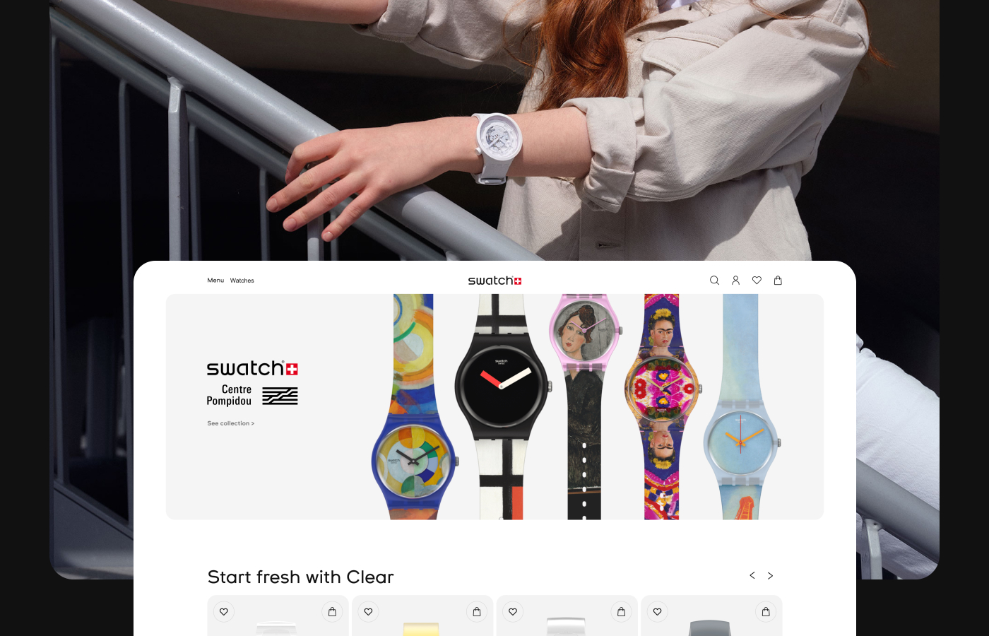
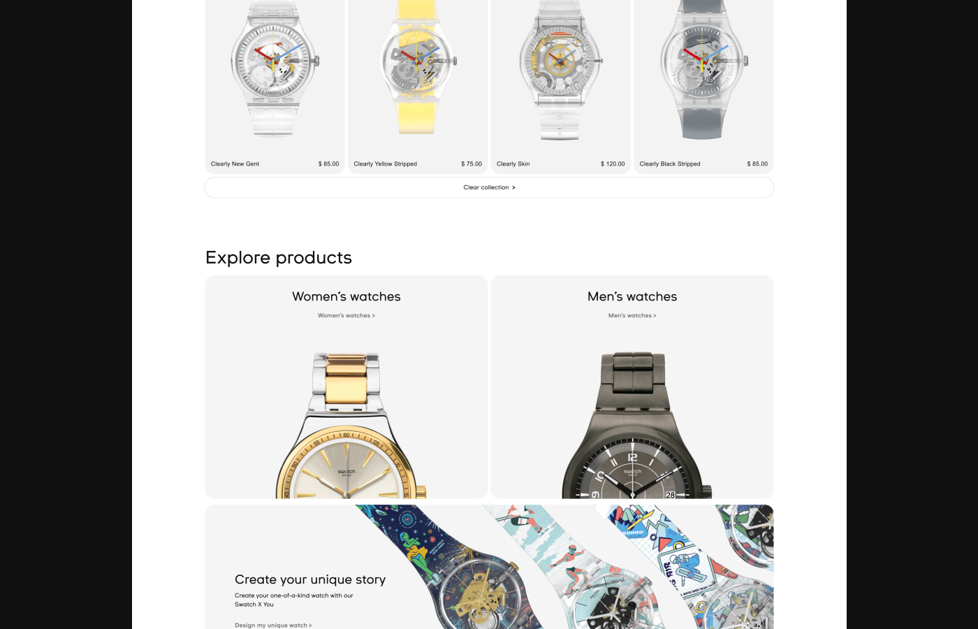
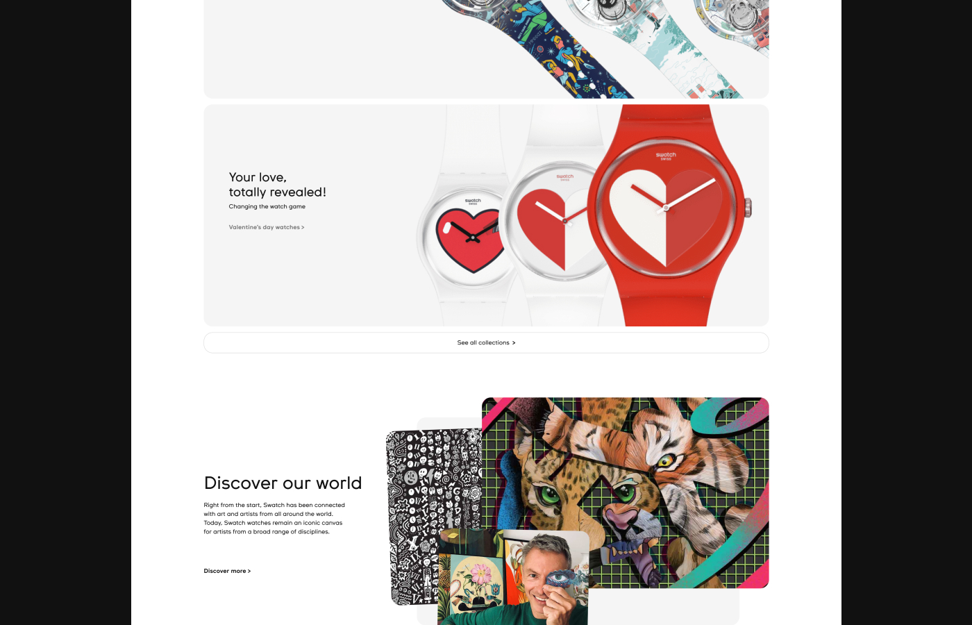
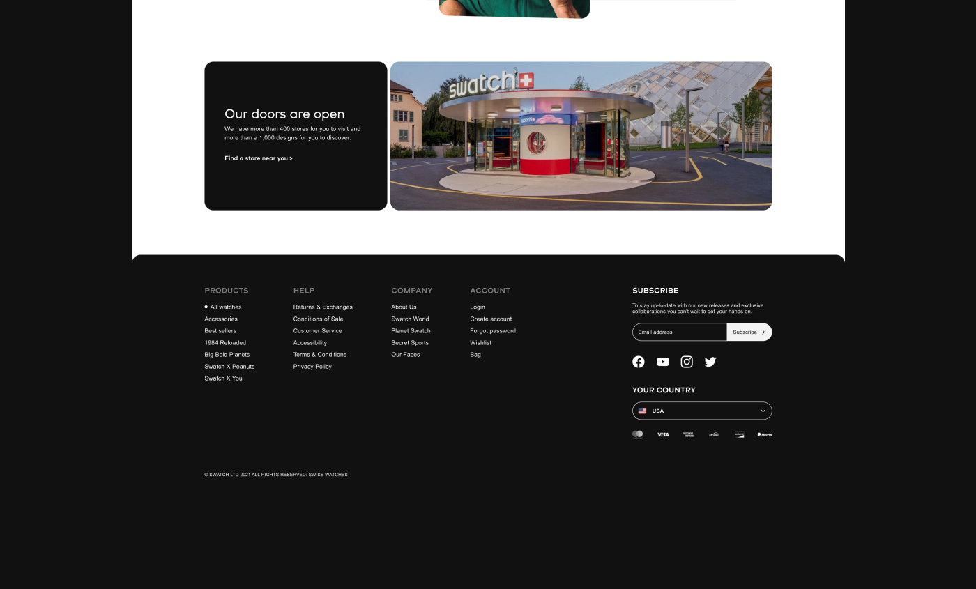
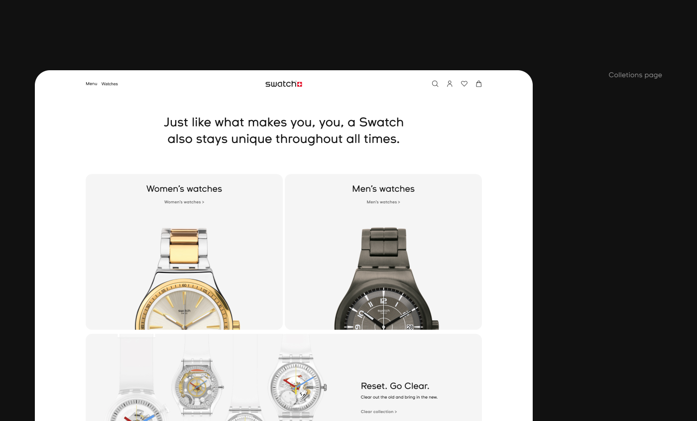
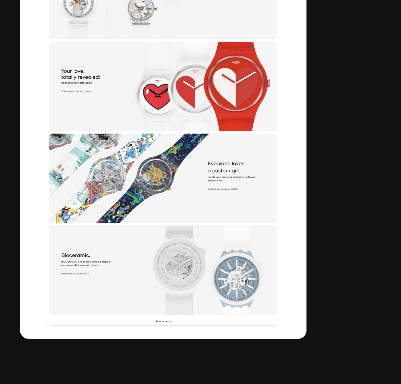
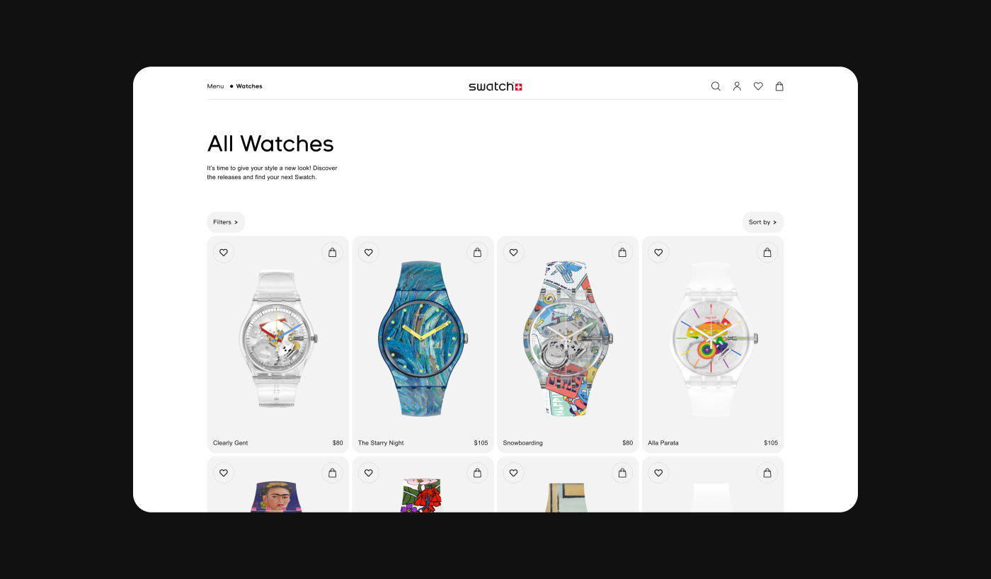
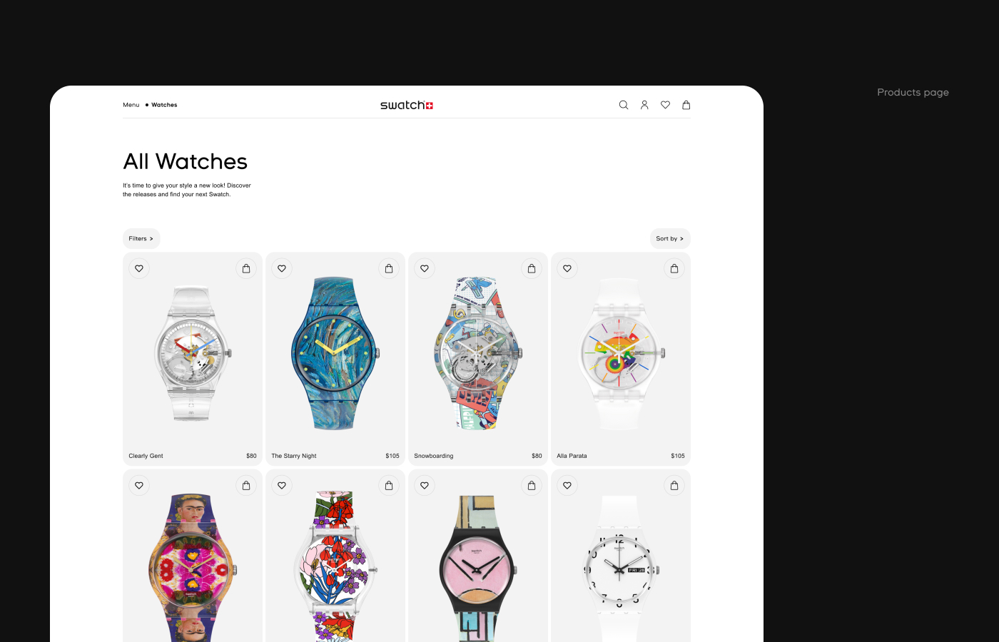
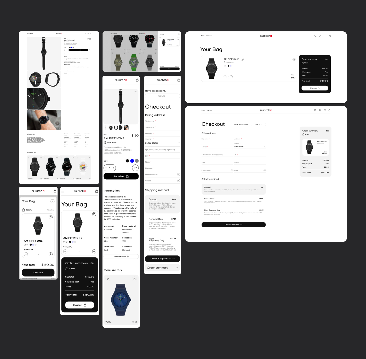
Swatch brand website redesign.
I've bought swatch watches recently and thought to make a redesign of its website. I found current website old with a bit hard user flow.
What i did:
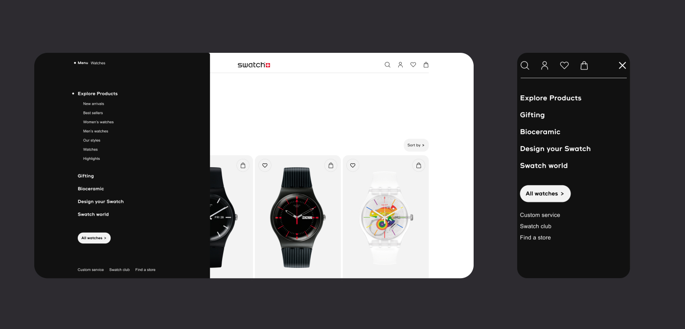
— Primary navigation is much simplifyed and Improved on whole website to get customer find what is needed faster and easy;
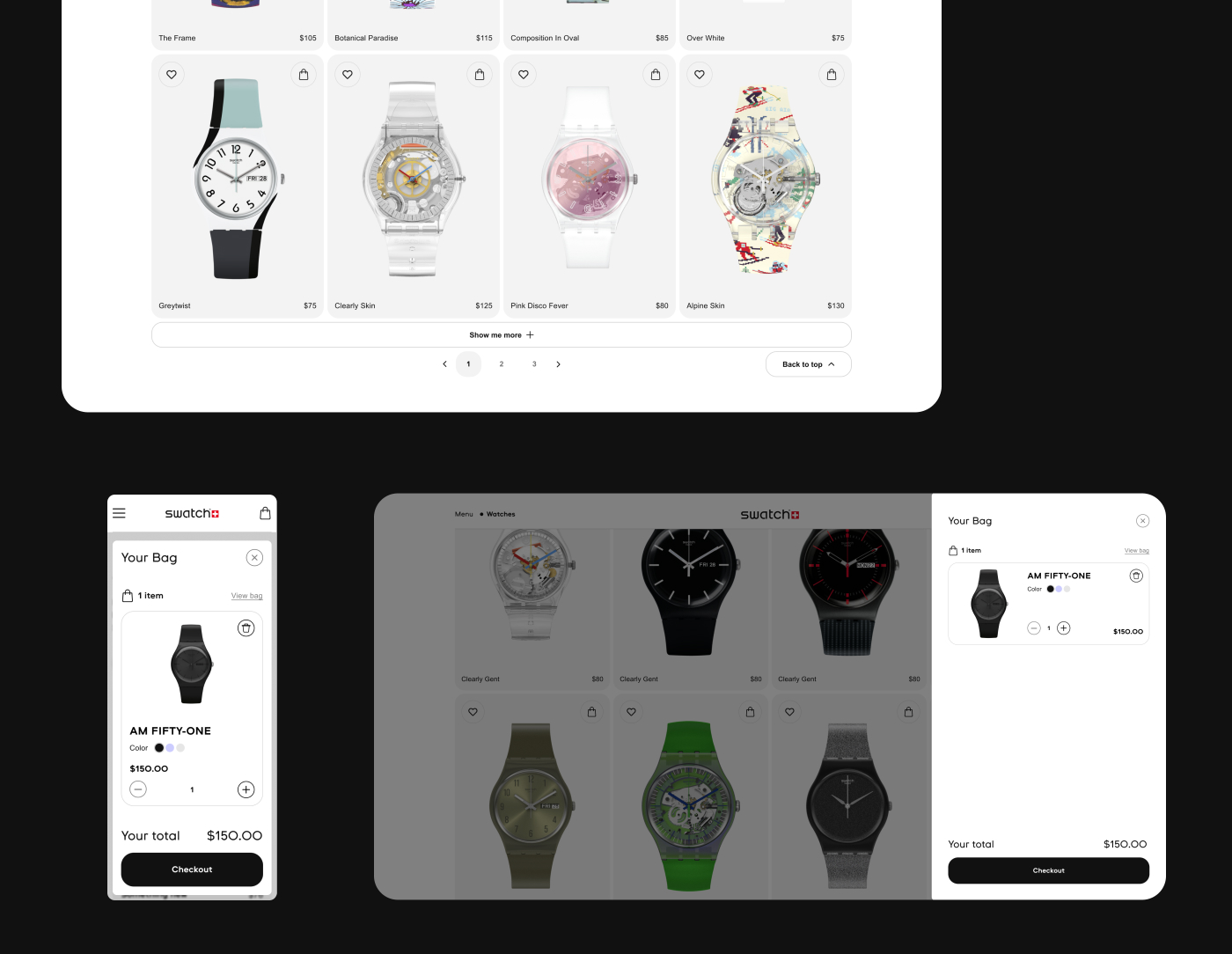
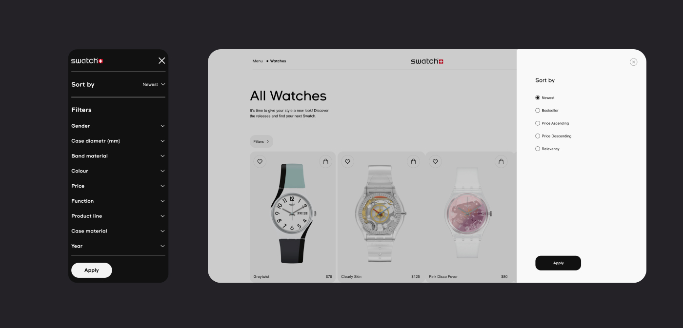
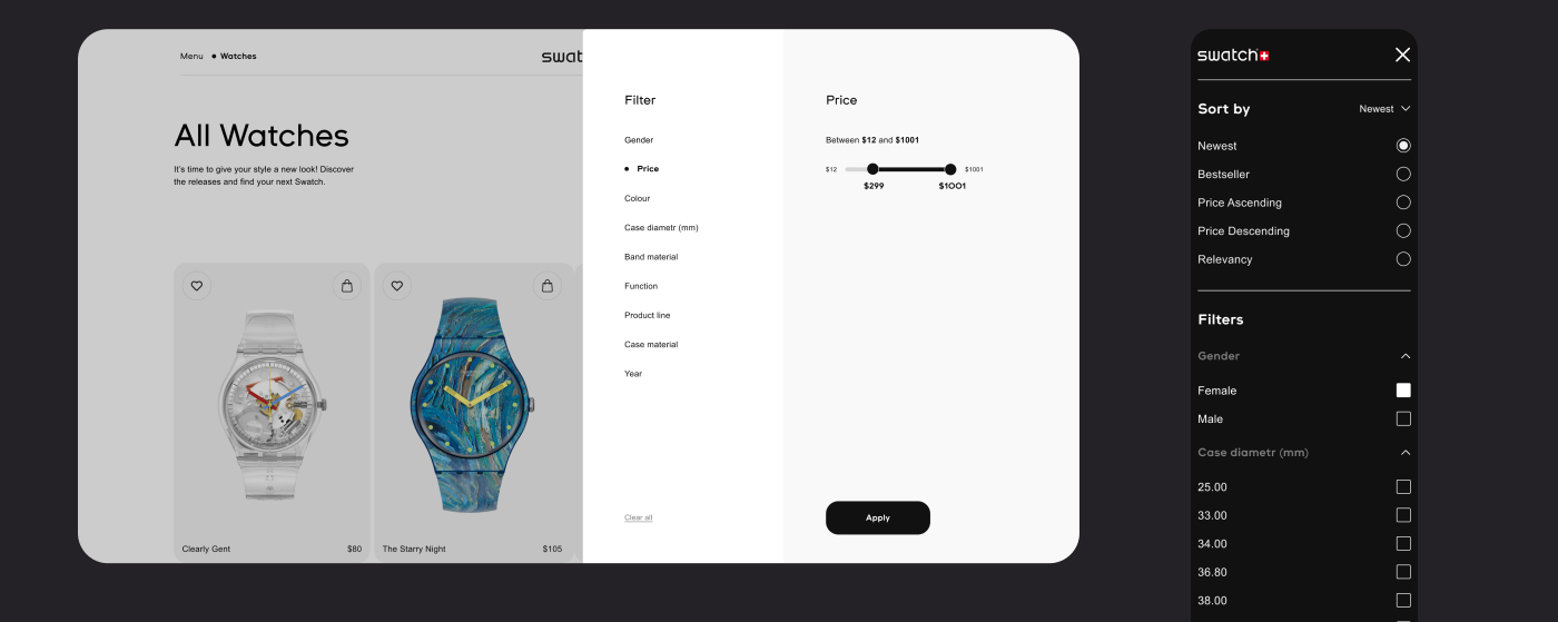
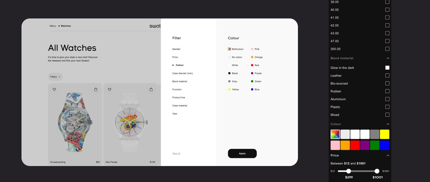
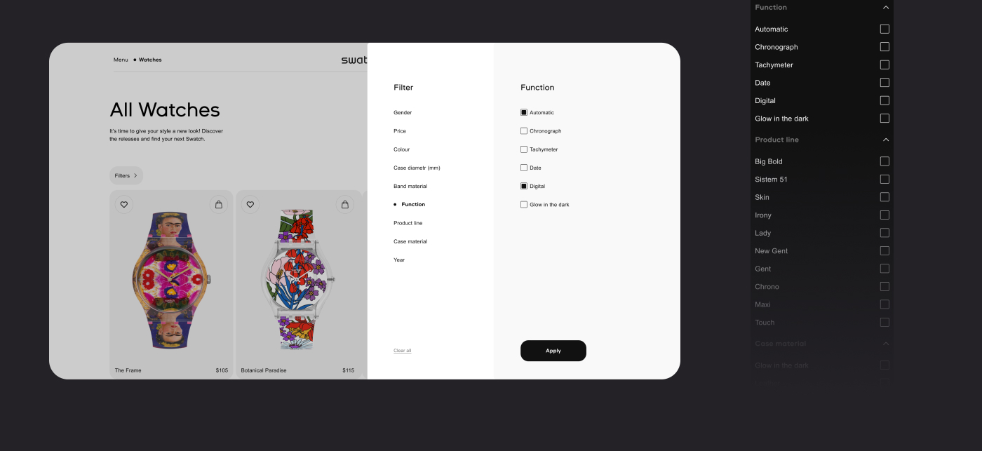
— Filters in product lists are upgraded on the all devices;
— Main landing buttons such as "all watches" added;
— "Bag" has new page, not just alt window;
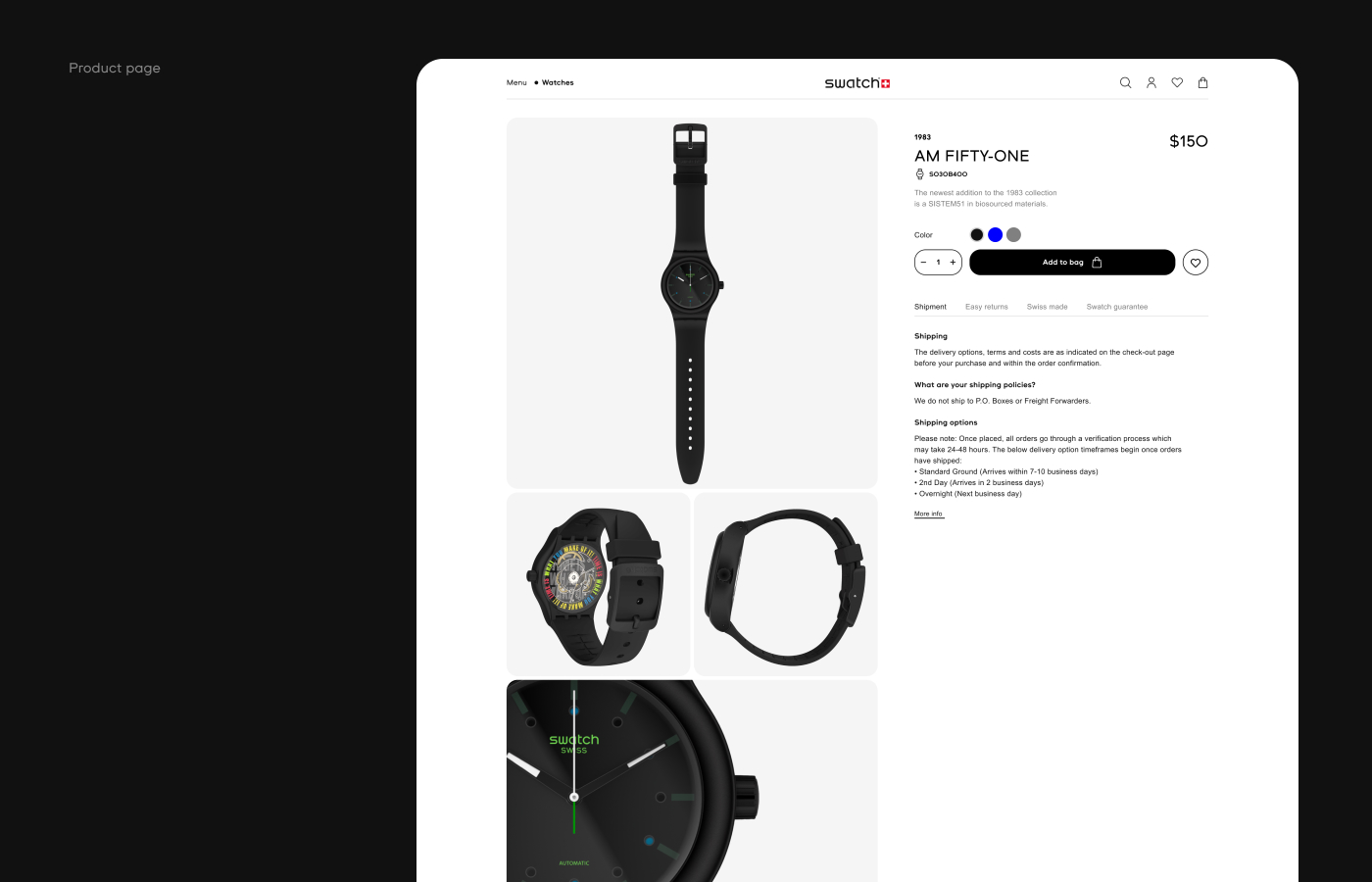
— Interface inputs are simplifyed . For example, "Checkout" page;
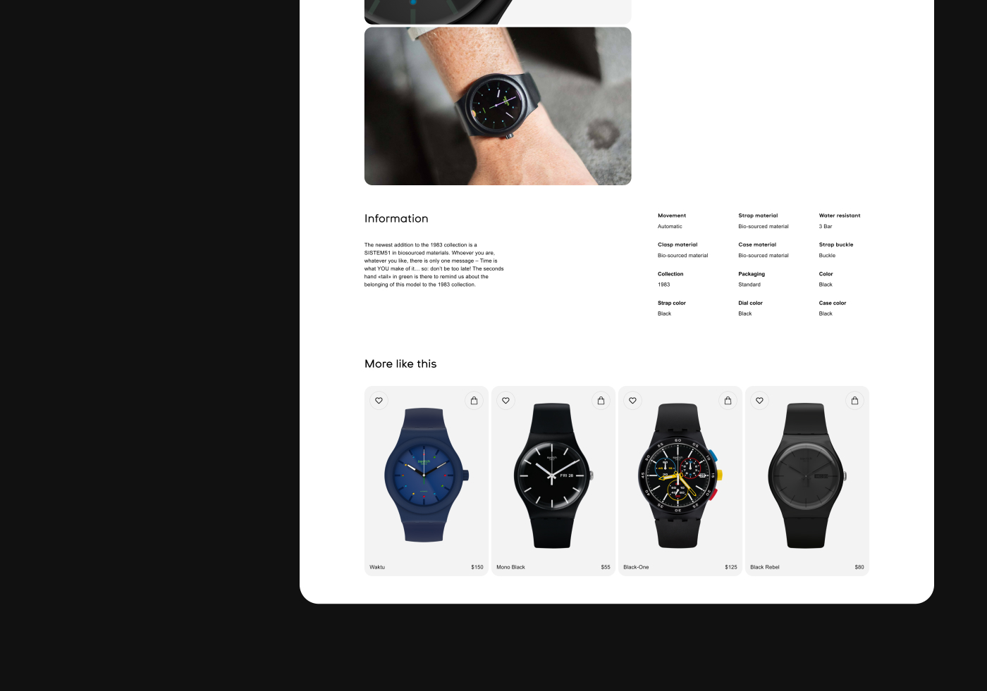
— The design system has been improved, less colours, more attention at the main information and landing links.
Tags:
– Design & Usability Research
– UIKit
– UX & UI
– Figma Expert
– UI/UX Prototyping
– Adobe Photoshop
– Web Design

